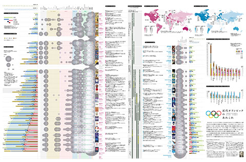
COVID-19
Numbers of Infected and Dead in Japan, Jan 2020-May 2023, Prefectural baseリソグラフ印刷バージョン
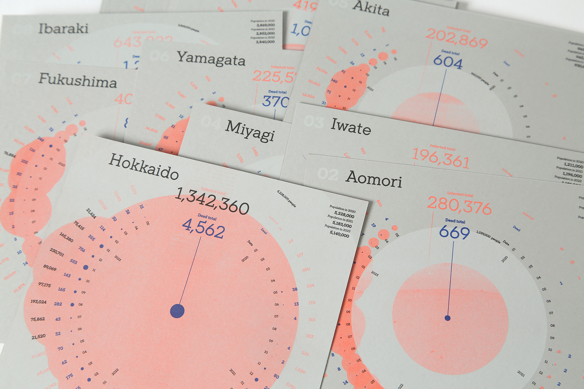
Numbers of Infected and Dead in Japan, Jan 2020-May 2023, Prefectural base
Diagram


Client: Private work
- 150×150 mm
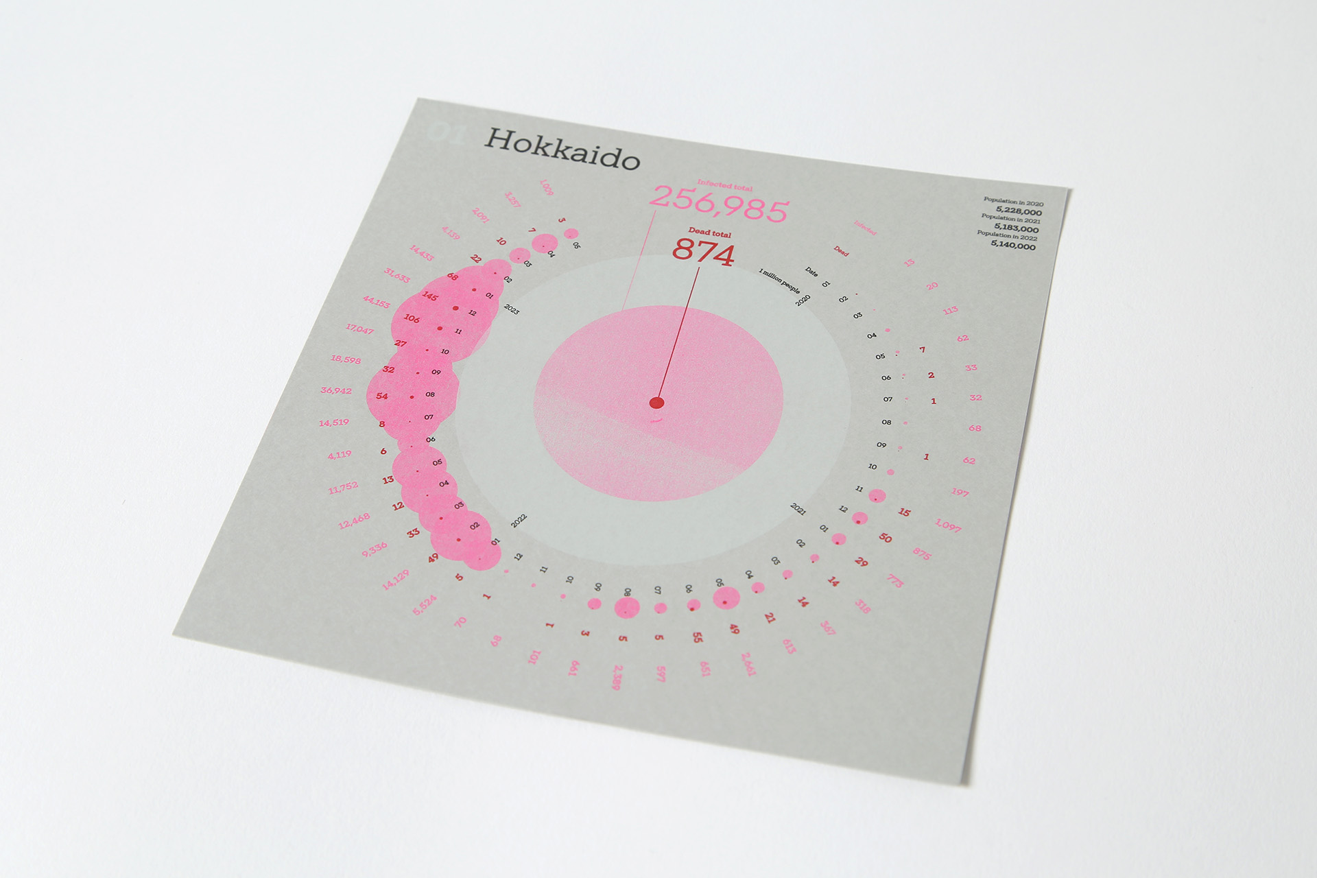
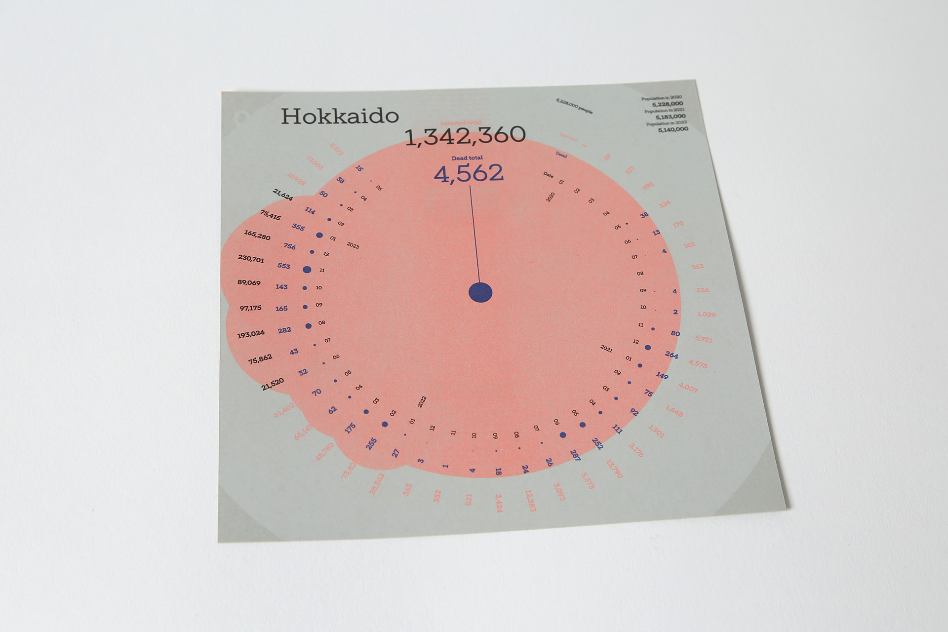
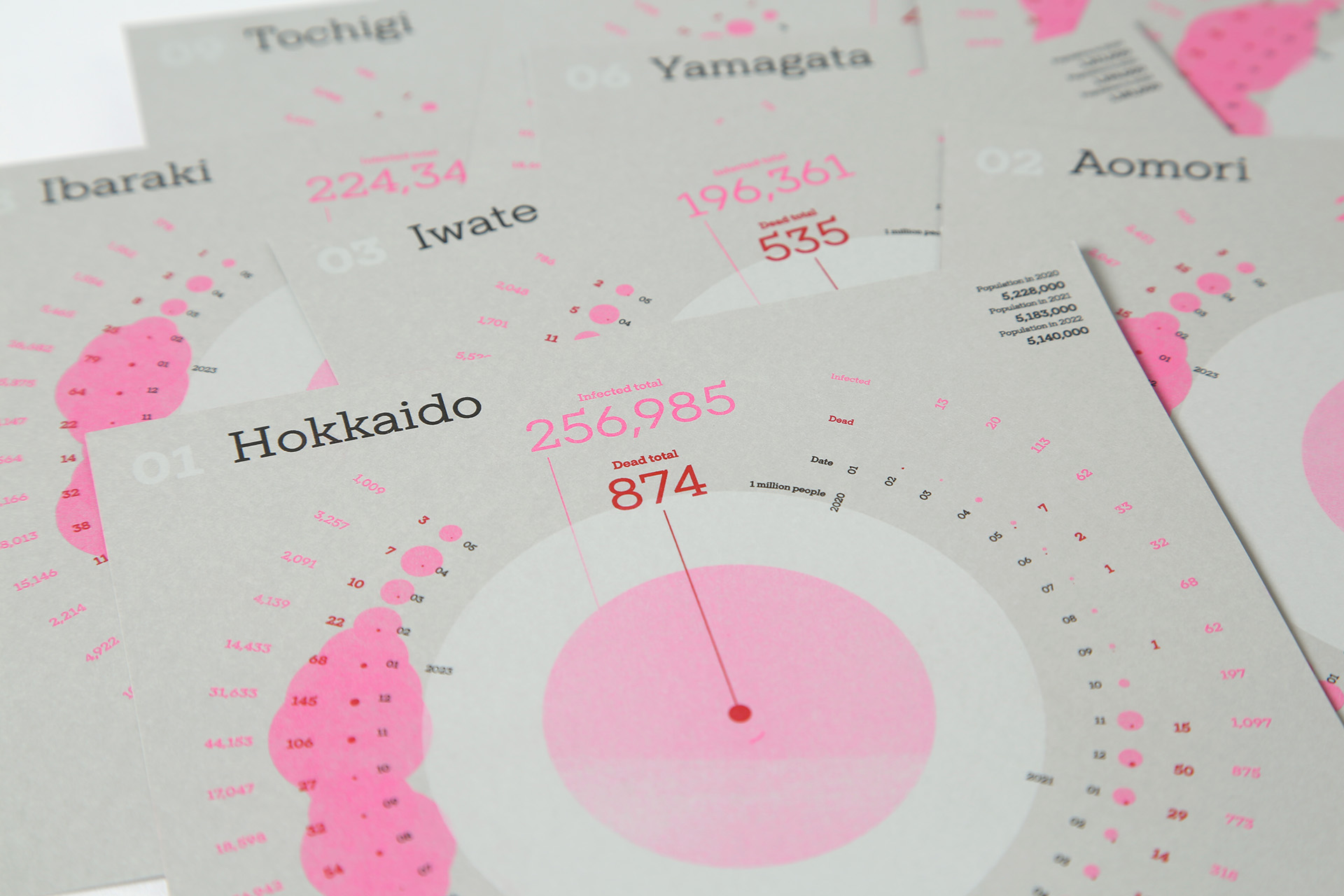
2020年1月から2023年5月までの、日本での新型コロナウイルスの感染者数・死者数を、都道府県別に視覚化しました。「100万人ごと」と「実数」でパートが分かれており、1つの都道府県につき1ページずつ同じ順番で並べ、いずれも、円が大きいほど数が大きいことを表しています。
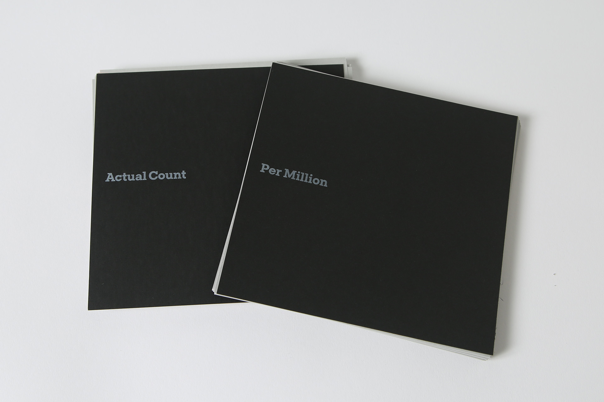
Per Million
白…100万人で表した人口
ピンク…100万人あたりの感染者数
赤…100万人あたりの死者数
Actual Count
白…その都道府県の人口
オレンジ…実際の感染者数
青…実際の死者数
About the diagram:
This shows the numbers of infected and dead by COVID-19 in Japan per prefecture since January 2020 to May 2023.
The diagram is consisted of two parts: Per Million and Actual Number. Data from each prefecture is shown in individual page and arranged in the same order. In each page, sizes of circles correlate to the numbers it represents.
Per Million
White: population divided by millions
Pink: the number of infected per one million
Red: the number of deaths per one million
Actual Count
White: the whole population
Orange: the actual number of infected
Blue: the actual number of deaths